The Chart widget displays quantitative attributes from an operational layer as a graphical representation of data. It allows end users to observe possible patterns and trends out of raw data. The operational layer can be one of the following:
- A feature layer in the current map
- A feature layer as an item in the portal
- A feature layer from ArcGIS Server REST Service
Tip:
A feature layer can be from a map service, feature service, or dynamic map service. It also must support query capabilities to work with the Chart widget.
A chart can represent the attribute values of a single field, aggregated values for multiple fields, or the total counts for features. A bar or column chart can even represent the attribute values of multiple fields as clustered bars and columns. When using the Chart widget, you can also specify a spatial filter to request only desired features to be in the chart.
Generally, there are four options to analyze, calculate, and display values of a feature layer as charts:
- Display values feature by feature—This chart depicts values of one or multiple fields for each feature in the layer and displays values feature by feature. For example, in a cities layer, you may want to display the population for each city as a bar, column, line, or pie chart. You may also want to display the male and female population as clustered bars and columns per city.
- Display values by category—This chart depicts statistical values of one or multiple fields for each category of features in the layer. For example, in a cities layer, if you specify the state field as the category, you can display the total population for cities per state.
- Display feature counts by category—This chart depicts total feature counts for each category of features in the layer. For example, in a cities layer, you can specify the population class field as the category, and calculate the counts of cities in each population class.
- Display attribute values as charts—This chart depicts the statistical value for a specified field or fields in the layer. For example, in a cities layer, you can display the total population as a bar for all cities in the year 2000, and the other bar for a total population of all cities in the year 2010.
When displaying attribute values as bars, lines, or segments in a pie chart, a statistical operator is performed on the field values. The aggregate can be one of the following:
- The average value across features
- The maximum value of all features
- The minimum value of all features
- The total value of all features
Configure the Chart widget
This widget can be set to open automatically when
an app starts. To enable this feature, click the Open this widget automatically when
the app starts button  on the widget, which turns it dark
green.
The Chart widget supports multiple chart tasks. Configure the following parameters to make a chart:
- Set the Data Source, Chart Title, and Description options.
- Select how you want to analyze and display data.
- Set the chart appearance by specifying its types, display settings, and data fields.
- Set the map display for the data.
- Hover over the widget and click the Configure this widget button
 to open the configuration properties dialog box.
 - Optionally click Change widget icon and replace the default icon for this widget with an image of your own.
A file explorer window appears, allowing you to select a local image file to use as the widget icon.
- Click Add New to create a new chart.
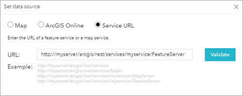
The Set Data Source window appears. The data source can be from a layer in the current map, portal, or ArcGIS Server service. For this exercise, choose Add Service URL and add a service URL.
- Click OK.
The Settings tab opens.
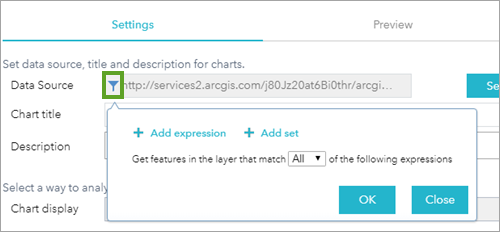
- Optionally click the data source filter button
 next to the Data Source field to create filter expressions for your data content.
- Provide a chart title and description.
- Click the Chart Display drop-down arrow and choose Display values feature by feature.
There are four options to analyze, calculate, and display values of a feature layer in a chart. The appearance of a chart is specified by the chart type, color, value fields, and so on. It varies based on the display options of the chart.
- For Display values feature by feature, do the following:
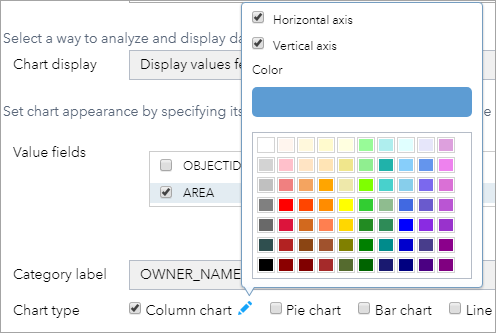
- Choose one or multiple fields in Value Fields. If multiple fields are selected, they display as clustered bars and column charts.
- Choose a label from the Category Label drop-down fields.
- Choose at least one Chart Type and specify its display.
- For Display values by category , do the following:
- Click the Category Field drop-down list and choose a field. This field is used to categorize features and label categories.
- Choose one or multiple fields in Value Fields. If multiple fields are selected, they display as clustered bars and columns.
- Choose an operation from the Operation drop-down list. For aggregate values, four operations are supported: sum, average, minimum, and maximum.
- Choose at least one Chart Type and specify its display.
- For Display feature counts by category, do the following:
- Click the Category Field drop-down list and choose a field. This field categorizes features and labels categories.
- Choose at least one Chart Type and specify its display.
- For Display attribute values as charts, do the following:
- Choose one or multiple fields in Value Fields. For each selected field, the statistical value displays separately as a bar, column, line, or pie segment.
- Choose an operation from the Operation drop-down list. For aggregate values, four operations are supported: sum, average, minimum, and maximum.
- Choose at least one Chart Type and specify its display.
Note:
For the pie chart, you can add a legend to your chart for any of the four display options. For other types of charts (for example, a bar chart), you can add a legend only if you select both the Display values feature by feature and Display values by category display options.
- For Display values feature by feature, do the following:
- Optionally, you can sort the fields if necessary by label or value.
- Click a symbol next to Selection Symbol to set the symbol for the charted features on the map.
- Click a color next to Highlight Color to set the highlighted color for the charted features on the map when hovering over the chart.
- Click the Preview tab to preview the chart. For column, bar, and line chart types, their axis labels automatically rotate in response to the density of the bars, columns, and lines. When multiple fields are selected in Value Fields, these types of charts support multiple colors for the clustered bars, columns, and lines.
- Repeat steps 3 through10 to add more chart tasks.
- Click OK to complete the configuration.
The configuration window for this widget appears. If there are any existing chart tasks, they appear in the window.
Use the Chart widget
When the Chart widget is activated in the app, follow these steps to run it:
- Select a task to execute the chart.
- Make a spatial selection in the map using the current map extent or by drawing a graphic on the map. If the spatial selection results in a valid selection set, the chart automatically displays on the Chart Results tab when you click Apply.
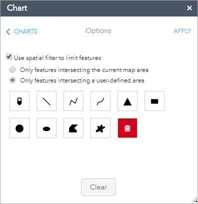
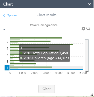
- Hover over each individual piece in the chart to display the category value and the field value and to highlight the corresponding feature on the map. Click each individual piece in the chart to zoom to the charted features on the map. When more than one type of chart is configured, click the arrows to browse through the individual types.
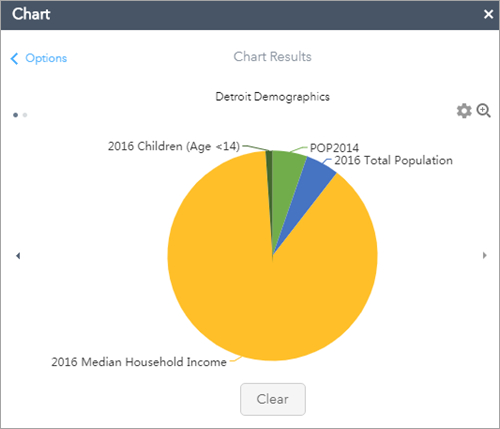
- Optionally click the settings button
 to change the chart display.
 - Click the zoom in button to get a closeup view of the chart.
Tip:
The maximum features to display in a chart depend on the maxRecordCount property set in the service.